TC Flex 2.0 software offers a higher degree of personalization & customization to projects and the various URC Graphical User Interfaces (GUI's).
When you build your graphics for TC Flex, it's important to understand how the various graphics scale and how to determine the required graphic image size for backgrounds and buttons.
This article details how to create and import graphics using the Background and Button Graphics & Scaling options in TC Flex 2.0
Flex 2.0:Background and Button Graphics & Scaling
- When it is important to make precise placement of images on a background or otherwise have the background displayed exactly as
displayed in the simulator, that background image should be the exact dimensions of the target client so that the system does not need to do any scaling. Shown below is an image from a dealer system* (LS3) as an example. They needed to place TKP-7600 functional buttons over the “buttons” in the image.
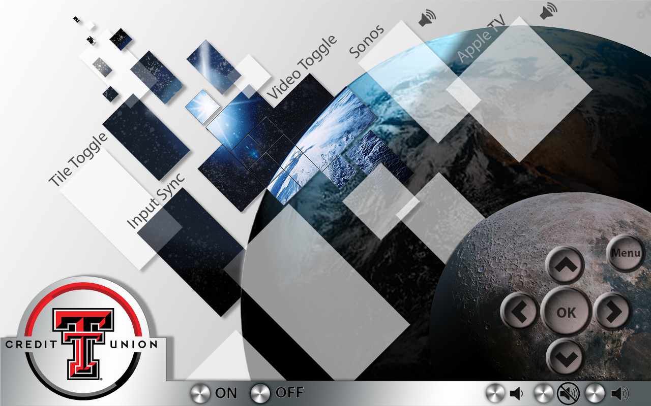
The full background image resolution needed was 1280 x 800 (pixels).
We can determine the background image properties by right-clicking on the image and selecting the Properties>Details tab: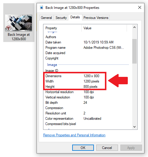
But, we first need to determine the full background graphic image size required for the client device (URC UI).
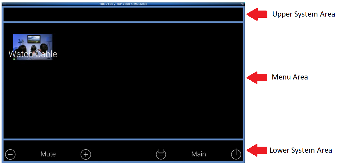
On each client, the screen is split into Upper System Area, Menu Area, and Lower System Area sections. To determine the full background graphic image size required, we can simply add the height dimensions together for the three sections.
Here are the height dimensions for each of these sections:LANDSCAPE MODE Upper System Area (Top Bar) Menu Area Lower System Area (Bottom Bar) TKP-7600/TKP-9600 1280x73 1280x616 1280x111
So, to get the full background graphic image size required, we add the numbers in RED together from the table above.
The width remains at 1280 but the height is the sum of 73 + 616 + 111 = 800. This is where we get the required 1280 x 800 pixels image requirement.
Please refer to the article on TC Flex Reference Resolution here for additional user interfaces: https://urcfaq.knowledgeowl.com/help/flex-20-reference-resolutions-for-uis - When an image is dragged from the image gallery to the client UI simulator, the image is scaled by a predetermined amount so that it is an appropriate size for the target client. It does not keep the original size. This means that someone (or URC) could make one set of graphics to use across different UI’s, like what is done in Accelerator.
Please refer to the article noted above for more information. - The scaling factors are percentage of actual image dimensions
- Most URC Touchscreens (TDC-7100/TKP-9600 etc) = 31.25%
- TKP-5600 = 23.438%
- TRC-1480 = 14%
- Mobile Devices = 100% - Using the button properties “Import” button
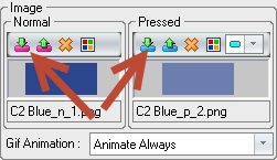 will bring in the button at full size regardless of the target device. So, it must fit on the screen. Button pressed and normal states must always be the same dimensions whether dragged from the gallery or imported.
 - To get fully functional normal and pressed state from an image gallery drag using custom buttons, the images (normal and pressed) must be named correctly and must be identical dimensions. Naming convention is Button Name, state, font index.
- Button name can be anything without underscore _ characters. The button names for the two states must match.
- State indicates if it is normal (N) or pressed (P) state and must be surrounded by underscores.
Example: _N_ - Font index is not required. It uses the information in the folder’s Font.ini file to apply text settings for each button state based on the included index number. Just leave off the number if not using it but keep the preceding underscore.
- Full button pair example for normal and pressed state:
Example Button_N_1.png = Normal State
Example Button_P_2.png = Pressed State
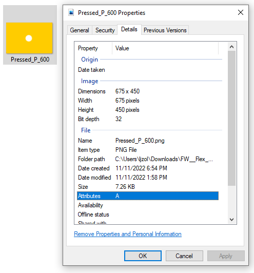
- There is a hidden routine in the image galleries that will automatically assign an image named “Pressed_P_600” as the pressed state for an image that does not already have a matching pressed state, if it is the exact same dimensions. This was put in for the main menu icon libraries that only have normal states. A sample image is shown below. This does not work as well for standard button galleries because the images are various dimensions


 will bring in the button at full size regardless of the target device. So, it must fit on the screen. Button pressed and normal states must always be the same dimensions whether dragged from the gallery or imported.
Buttons & graphics can be added to all three (3) sections available:
● Upper System Area: Outside of the system buttons, any button can be added and programmed.
● Menu Area: Almost any button can be placed in this available space.
● Lower System Area: Outside of the system buttons, any button can be added and programmed.
*Thanks to Nathan G. at LS3 - Lubbock Sight Sound & Security for the use of this graphic.
Additional Information & Resources:
Please refer to the article Programming: URC Accelerator vs. TC Flex for additional information on the differences between Accelerator & TC Flex.
Please refer to the article on TC Flex Reference Resolution for additional information for graphics and resolution for the various URC user interfaces.
To learn more about TC Flex configuration and programming, please download the TC Flex Programming Guide.
